
티스토리 뷰
목차
그림자의 효과
그림자는 웹디자인에서 입체감 / 깊이를 주는 아주 좋은 요소이다.
(내가 정말정말정말 좋아하는 요소이다!!)

그림자 함수 box-shadow
div{
    box-shadow: 10px 5px 5px #aa96da;


    width: 100px;
    height: 100px;
    background : #a8d8ea;
    border-radius: 10px;
}
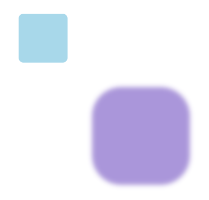
box-shadow 구조
div{
    box-shadow: 200px 200px 10px 50px #aa96da;


    width: 100px;
    height: 100px;
    background : #a8d8ea;
    border-radius: 10px;
}
가로 / 세로위치
첫번째 두번째 인자는 가로 / 세로위치를 뜻하며,
기본적 그림자 크기는 대상의 크기와 같다.
div{
    box-shadow: 200px 200px #aa96da;


    width: 100px;
    height: 100px;
    background : #a8d8ea;
    border-radius: 10px;
}

흐려지게 만들기
그림자의 크기에서 값 만큼 흐려지면서 더 그려진다.
div{
    box-shadow: 200px 200px 10px #aa96da;


    width: 100px;
    height: 100px;
    background : #a8d8ea;
    border-radius: 10px;
}
그림자 크기 조절
기본값(대상의 크기)에서 값만큼 더해준다.
div{
    box-shadow: 200px 200px 10px 50px #aa96da;


    width: 100px;
    height: 100px;
    background : #a8d8ea;
    border-radius: 10px;
}
그림자 여러개 만들기
그림자는 여러개 생성도 가능하다!!!
div{
    box-shadow: 5px 5px rgba(170, 150, 218, 0.4),
                10px 10px rgba(170, 150, 218, 0.3),
                15px 15px rgba(170, 150, 218, 0.2),
                20px 20px rgba(170, 150, 218, 0.1),
                25px 25px rgba(170, 150, 218, 0.05);


    width: 100px;
    height: 100px;
    background : #a8d8ea;
    border-radius: 10px;
}
마치며
참고하면 좋은 사이트!!
좋아하는 스타일은 모두가 있지만
그때그때 처음부터 만들기엔 우리의 일은 태산같다.
그럴때 참고하면 좋은 사이트!!!
CSS Scan - The fastest and easiest way to check, copy and edit CSS
Goodbye to "Inspect Element" — Visualize the CSS of any element you hover over, instantly, and copy its entire rules with a single click.
getcssscan.com

끗!
'웹개발(프론트)' 카테고리의 다른 글
| Vs Code 작업속도 빠르게 하는 법!(확장 프로그램) (0) | 2021.02.21 |
|---|---|
| GitHub 사용법 (0) | 2021.02.20 |
| Visual Code 자동완성 만들기, User Snippets (0) | 2021.02.16 |
| Visual Code 자동저장 하기 (0) | 2021.02.15 |
| 무료 icon 쓰기 / fontAwesome (0) | 2021.02.14 |
댓글
공지사항
최근에 올라온 글
최근에 달린 댓글
- Total
- Today
- Yesterday
링크
TAG
- switch
- visualcode
- Router
- 쿠키
- Redux
- dom
- html
- 랜더링
- 접근성
- 아이콘
- 무료아이콘
- proptype
- 비동기
- Hook
- 에러
- usecookies
- react
- 가상샐렉터
- touchable
- 이쁜코드
- CSS
- nodejs
- 서버
- Expo
- SVG
- useReducer
- 웹접근성
- async
- homebrew
- 클릭
| 일 | 월 | 화 | 수 | 목 | 금 | 토 |
|---|---|---|---|---|---|---|
| 1 | ||||||
| 2 | 3 | 4 | 5 | 6 | 7 | 8 |
| 9 | 10 | 11 | 12 | 13 | 14 | 15 |
| 16 | 17 | 18 | 19 | 20 | 21 | 22 |
| 23 | 24 | 25 | 26 | 27 | 28 | 29 |
| 30 |
글 보관함